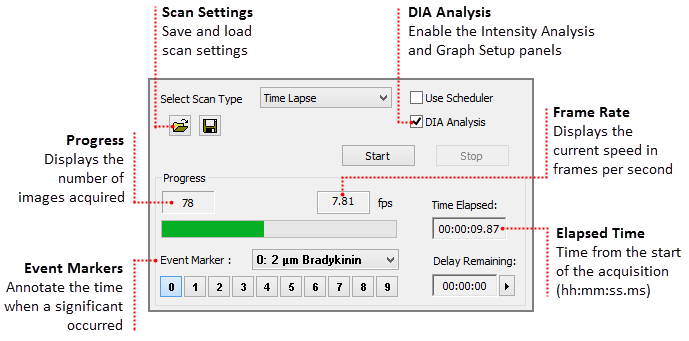
Dynamic Intensity Analysis (DIA) is optimized for high speed processing and intensity analysis over time, including Live viewing of images and data simultaneously. The updated interface was designed to reduce the number of steps required to set up and run an intensity analysis experiment, while providing the necessary tools to get the job done. Measuring and plotting of data is available on-line or off-line, and may be access by clicking DIA Analysis in the Sequence Pane. This functionality is only available in HCImage DIA and HCImage Analysis.
Note: A copy of the intensity measurement data is written to a spreadsheet file (.csv) and saved in the same folder as the data document.
Custom measurements are available to deal with complex situations, use the built-in equation editor to apply standard measurements and mathematical functions to customize special measurements to suit specific applications. To create a custom measurement, click Select Measure and then click Define to open the equation editor.
The Side Panel includes the Dynamic Intensity Analysis functionality, that is accessed through the Sequence pane by selecting DIA Analysis. Once enabled, the Intensity Analysis and Graph Setup panels are available, providing the tools to setup an experiment without having to switch panes.

The Scan Settings panel is easy-to-use, simply set the speed, define the capture interval, enter the number of images to capture and where to save the data.
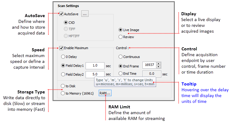
Use AutoSave to define where save acquired data.
Determines if a live view is displayed in the image display or if acquired images may be reviewed during the acquisition.
Select the maximum speed or a capture interval.
Select whether write directly to disk or to memory for high speed streaming.
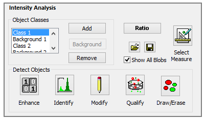
The Intensity Analysis panel is configured based on the selected Analysis mode: Simple or Advanced. By default, the Simple Analysis mode is enabled, but may be changed clicking View on the menu bar, then highlighting Analysis Mode and selecting Advanced. The Advanced mode provides a comprehensive set of tools to help identify large numbers of objects and objects that are not easily differentiated. The Simple mode provides a variety of drawing tools (shown above) that can be used to manually identify objects of interest.
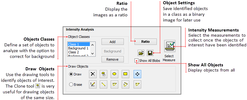
Hint: Click the Ratio button to display the image as a ratio. You can also apply pseudocolor to visually enhance the image. To apply a pseudocolor, select Contrast from the histogram and then select one of the options from the Curve drop-menu.
Classes are a set of measurements pertaining to a set of objects. Create multiple classes and then using custom measurements relate one to the other. After a class has been created, the user has the option to correct for the background fluorescence of the objects in that class. Once the objects in a class have been identified, click the Background button to identify an area to use for the background correction. Both the corrected and uncorrected data for each of the selected measurements will be collected. Click Add to create additional classes and Remove to delete them.
Note: If a user wants to correct for background fluorescence of multiple class, then a background must be selected for each class.
The Simple Analysis Mode provides a set of drawing tools for the user to manually identify objects of interest. Use the Clone tool to create copies of the last object drawn. Objects may be moved by selecting the object, clicking on the Move shapes tool and clicking on a object and dragging it to a new location. Objects are numbered in the order that they are created, moving an object to a new location will not change the object number. Select Bigger Labels from the Show Blob's Label icon (![]() ) drop-menu to increase the font size. The object number is displayed when the object is created, click the Show Blob's Label icon to hide the numbers.
) drop-menu to increase the font size. The object number is displayed when the object is created, click the Show Blob's Label icon to hide the numbers.
Note: To switch between the two analysis modes go to View on the menu bar, then highlight Analysis Mode and select Advanced.
In the Advanced Mode, the user has the ability to identify a large number of objects, as well as, identify hard to detect objects because of defects in the image. The tools are grouped by function as described below:
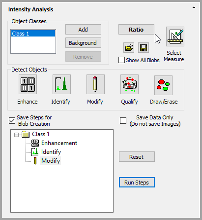
Save and reuse the steps used to detect objects or choose to save only the data and discard the images.
Intensity measurements are available in the Select Intensity Measurements dialog, click the Select Measurements icon to open the dialog. Select measurements by clicking the measurement check box to the left. Filter the view of the measurements by selecting one of the categories in the right. When correction for background fluorescence, the corrected and uncorrected data for each of the selected measurements will be collected.
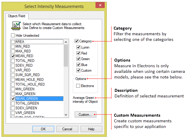
Note: When using the ORCA-Fusion series or the ORCA-Quest, select Measure in Electrons, to report the intensity measurement values in electrons. When Measure in Electrons is selected, measured data will ONLY be reported in electrons. Measurement names will be preceded by an "e" denoting the measurement is in electrons.
Custom measurements are available to deal with complex situations, use the built-in equation editor to apply standard measurements and mathematical functions to customize special measurements to suit specific applications. To create a custom measurement, click Select Measure and then click Custom to open the equation editor.
The Graph Setup panel lets users decide the measurements that will be displayed during the experiment and how the graphs will be displayed. The user can choose to display the data from a single object, the average of all of the objects, or all of the objects. The data for all of the measurements in the View Measurements list will be collected and saved, regardless of whether they are graphed during the experiment. Also, keep in mind that depending on the number of objects and measurements selected, the graph will become very crowded and it may become hard to differentiate the objects.
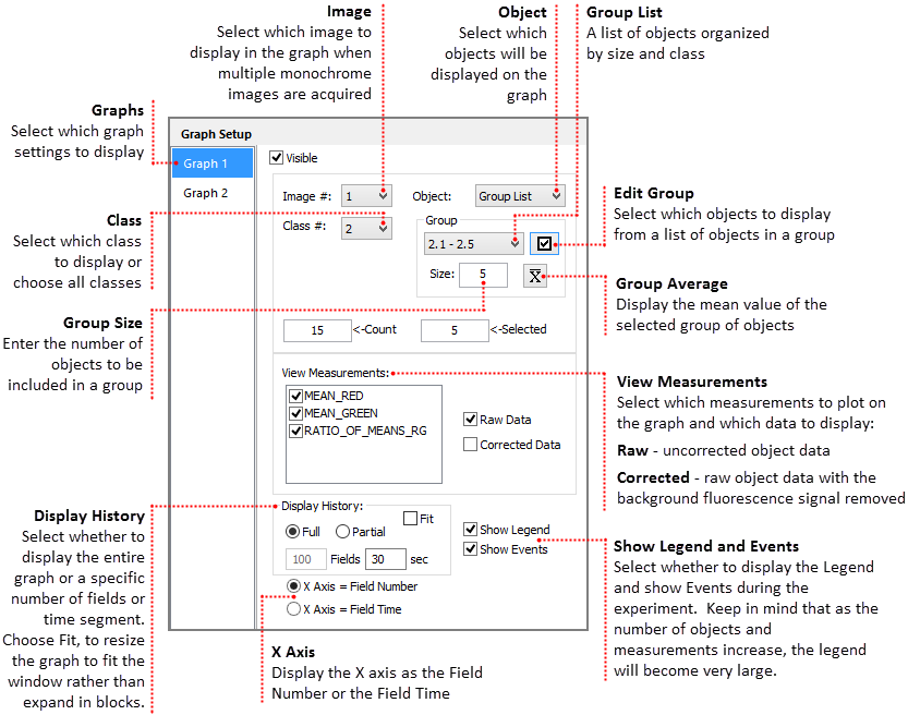
The data for all of the measurements in the View Measurements list will be collected and saved, regardless of whether they are graphed during the experiment. Also, keep in mind that depending on the number of objects and measurements selected, the graph will become very crowded and it may become hard to differentiate the objects.
Select which image to graph when acquiring multiple monochrome images.
If multiple classes have been identified, use the drop-menu to select one. The Count box displays the total number of objects in the selected class. Select which object(s) to view on the graph using the Object selection box. The option to select all objects or the average of the objects is also available.
The Object list provides multiple options for determining which object(s) will plotted on the graphs.
Define group settings according to:
All of the selected measurements from the Select Intensity Measurements dialog are displayed in View Measurements. By default all of the measurements are selected with a check mark in Graph 1 and Graph 2. Click the check box to deselect any of the measurements.
In addition to selecting which measurements will be graphed, the user has the option to select the type of object data to plot on the graph.
Lets the user decide whether to display the entire graph throughout the experiment or a specific number of fields or time segment.
When Full is enabled, the graph expands in blocks rather than always fitting to the window. Select Fit to auto expand the graph to always fit the window.
Note: The data for all of the measurements in the View Measurements list will be collected and saved, regardless of whether they are graphed during the experiment. Keep in mind that depending on the number of objects and measurements selected, the graph and legend will become very crowded and it may become hard to differentiate the objects.
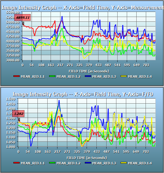
Visualize the Intensity Plot of multiple objects over time on dual real-time interactive graphs. Event Markers can be added to the data document file during acquisition as notable events occur in the experiment. Both the numbered buttons above and keyboard numbers may be used. The zoom features are described below.
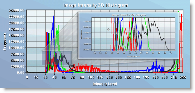
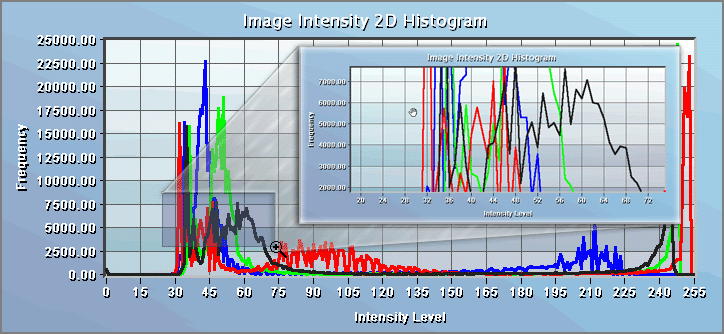
To zoom in on a particular area click and hold the left mouse button as you drag a box around the area of interest. Release the button and the graph zooms to the size of the box. Click the left mouse button to return to the normal view. While in a zoomed position the user can pan by dragging the mouse in the direction they wish to view. In the example below, a portion of a 2-D Histogram has been enlarged.
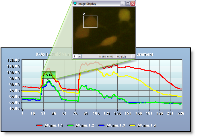
The objects in the Image Display are linked to the intensity lines in the graph. Simply click on one of the lines in the graph and a bounding box will appear around the corresponding object. Hovering the mouse over a line will temporarily display the object bounding box. The object bounding boxes display the object number and the object intensity is indicated on the graph as shown below.
There are times when it is necessary to move individual objects because the cell(s) or objects of interest shifted at some point during the experiment. To move an object during an experiment, click on the object and drag it to the new location. This can be done while Live, there is no need to pause the experiment. The object number will not change when moved.
Intensity plot normalization, this will divide all values by minimum values. Right-click on the graph and select Normalize Graph or Normalization Properties to define the range and increment. The graph on the bottom below is normalized.
Object Summary Statistics are collected for each of the Object Measurements made for each Measurement Class. As Object Measurements in a Workfile may be selected and deselected during data collection the Count value may vary between Field Measurements. Each statistic is computed according to the actual count of objects processed for each measurement selected.
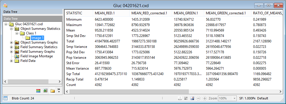
The Statistics computed for Object and Field Measurements are derived as follows:
Statistic |
Note |
Formula |
|---|---|---|
|
total number of items considered in the data set |
Count = N |
|
|
Minimum |
minimum occurring value in the data set |
Min (x) |
|
Maximum |
maximum occurring value in the data set |
Max (x) |
|
sum of all values in the data set |
Total value = (Σx) |
|
|
Mean |
total value divided by count of items |
µ = (Σx)/N |
|
used to characterize incomplete samples |
s² = (Σx² - (Σx)²/N)/(N-1) |
|
|
used to characterize incomplete samples |
s = √(s² ) |
|
|
used to characterize complete samples |
σ² = (Σx² - (Σx)²/N)/N |
|
|
used to characterize complete samples |
σ = √(σ² ) |
|
|
experimental uncertainty of an averaged measurement |
SEµ = s / √N |
|
|
Total of Values Squared |
sum of squares |
Σx² |
|
Total of Reciprocal Values |
sum of reciprocals |
Σ1/x |
Object Measurements can be plotted for each object in the data document. The Object Summary Graphs show Object Measurement data of all fields. The interactive graph lets the user customize the display. Use the graph toolbar to select the measurements and which class and objects to display. Use the right-click menu to customize the look and feel of the graph by changing the title and legend fonts or adjusting background and border colors. The right-click menu also allows users to display the X axis as number of fields or field time.
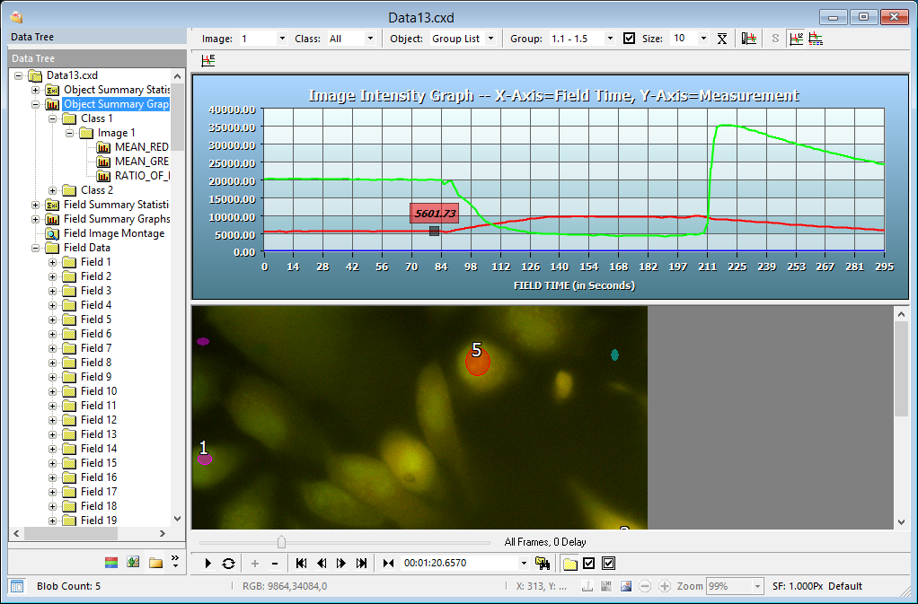
The toolbar provides multiple options for managing how the data is displayed.

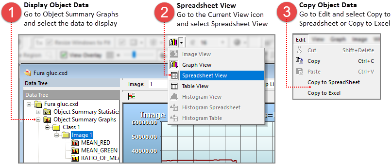
In addition to the Object Summary graphs, the intensity measurement data can also be displayed using a Spreadsheet View and a Table View. To change the view, go to the Image Data Views toolbar, click on the Current View icon () and select either Spreadsheet View or Table View.

Field Summary Statistics are collected for each of the Field Measurements made for each Measurement Class. As Field Measurements in a Workfile may be selected and deselected during data collection the Count value may vary between Field Measurements. Each Statistic is computed according to the actual Count of Fields processed for each measurement selected.
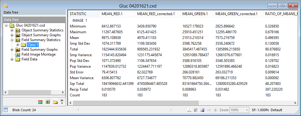
Opening the Field Summary Statistics node will display a node for each Measurement Class present. Selecting the Field Summary Statistics node will display all Field Measurement Classes. Under the Field Summary Statistics node is a node for each Measurement Class. Selecting the Class node will display the Field Measurement Data for the individual Class.
Field Measurements can be plotted for each Field in the Data Document. The Field Summary Graphs show Field Measurement parameters for each Measurement Class with the Field number as the X axis variable and the Field Measurement as the Y axis variable.
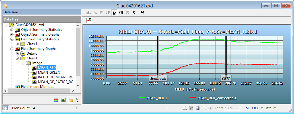
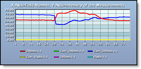
The Field Summary graphs are an easy to use interactive way of displaying and viewing data. First the Mean Red (Corrected 340nm) intensity is measured over time. Second there are two Event Markers that indicate specific points during the experiment that an event happened. In this case, we know the name of the reagents that were added and the time they were added. The Event Markers may be toggled on/off by clicking the Show Event Markers Icon (![]() ). The intensity at any given point is displayed by hovering the cursor over a section of the graph. The corresponding image may also be viewed by clicking on a point along the graph. Zoom in on a specific area of the graph by clicking and dragging the mouse over the area of interest. Release the button and the graph zooms to the size of the box. Click the left mouse button to return to the normal view. While in a zoomed position the user can pan by dragging the mouse in the direction they wish to view. Using the features in the Playback Toolbar we can play the image sequence and visually see the changes in the intensity and how they are plotted on the corresponding graph. Use the right-click menu to customize the look and feel of the graph by changing the title and legend fonts or adjusting background and border colors. The right-click menu also allows users to display the X axis as number of fields or field time.
). The intensity at any given point is displayed by hovering the cursor over a section of the graph. The corresponding image may also be viewed by clicking on a point along the graph. Zoom in on a specific area of the graph by clicking and dragging the mouse over the area of interest. Release the button and the graph zooms to the size of the box. Click the left mouse button to return to the normal view. While in a zoomed position the user can pan by dragging the mouse in the direction they wish to view. Using the features in the Playback Toolbar we can play the image sequence and visually see the changes in the intensity and how they are plotted on the corresponding graph. Use the right-click menu to customize the look and feel of the graph by changing the title and legend fonts or adjusting background and border colors. The right-click menu also allows users to display the X axis as number of fields or field time.
Field Data contains information for each field about when and where the image was captured. The data can be viewed in a Table View or Spreadsheet View and copied to the Windows Clipboard.
These details can include:
Use this method to export all of the collected intensity data from the data document to a spreadsheet. This includes the object and field data as well as the object and field summary statistics. With the data document open follow the steps below to export the intensity data to a spreadsheet.
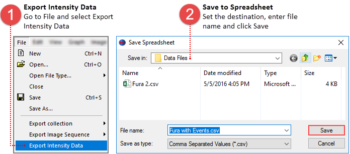
To copy only the data from a specific graph, select the graph and follow the instructions below.
